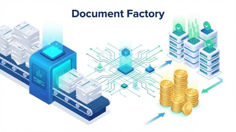
What Is Report Generation? The Ultimate Guide to Automated Intelligence (2026)
Data is the lifeblood of modern enterprise, but raw data alone is just noise. To make decisions, leaders need clarity. They need structure. They need context. This is where the concept of “Report Generation” comes in. Yet, many professionals struggle to define it beyond “printing a PDF.” So, what is report generation in the context of 2026 technology, and why is it the cornerstone of business intelligence?
According to Gartner, by 2026, automated storytelling will dominate business intelligence, replacing static dashboards with AI-generated insights. The days of manually compiling Excel sheets every Friday are ending.
In this definitive explainer, we will dissect what is report generation, exploring its evolution from manual entry to AI-driven automation. We will uncover how connecting data extraction tools like ParserData to reporting engines can transform your organization into a data-driven powerhouse.
Table of Contents
- 1. Definition: What is Report Generation?
- 2. The 4-Step Architecture of Reporting
- 3. Static vs. Dynamic vs. Interactive Reports
- 4. The Critical Role of Data Extraction
- 5. Key Types of Business Reports
- 6. Technologies Behind the Scenes (API, SQL, No-Code)
- 7. Strategic Benefits of Automation
- 8. Real-World Case Studies
- 9. Future Trends: Generative BI
1. Definition: What is Report Generation?
At its core, what is report generation? It is the systematic process of retrieving data from various sources, processing that data through a set of logic or filters, and converting it into a human-readable format.
Think of it as a factory line:
- Raw Material: Unstructured data (PDF invoices, server logs, database entries).
- Processing: Calculation, aggregation, and validation.
- Final Product: A visual document (Chart, PDF, Excel Table) that answers a specific business question.
In the past, this was a manual task. Today, understanding what is report generation means understanding automation. It is about setting up pipelines that create these documents without human intervention, triggered by specific events (e.g., “End of Month” or “Inventory Low”).
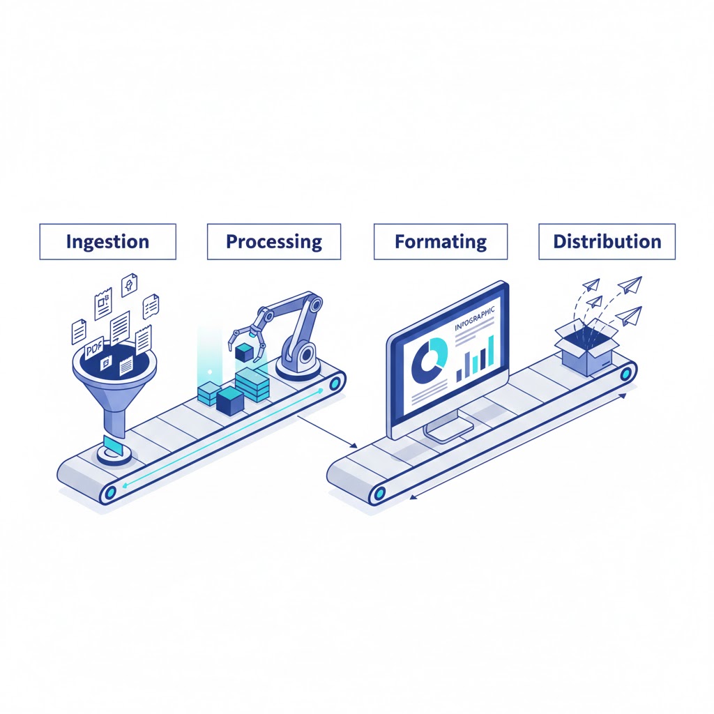
2. The 4-Step Architecture of Reporting
To truly grasp what is report generation, you must look under the hood. Regardless of whether you use a simple Excel macro or a complex enterprise BI tool, the architecture follows four distinct stages.
Stage 1: Data Sourcing (Ingestion)
Before you can report, you need input. Data resides in silos: CRMs (Salesforce), ERPs (SAP), and most problematically in unstructured documents like vendor invoices.
- Challenge: “Dark Data” locked in PDFs.
- Solution: Using extraction APIs. (See our guide on types of financial data extraction).
Stage 2: Data Processing (Transformation)
Raw data is messy. Dates are in wrong formats (MM/DD/YYYY vs DD/MM/YYYY), and currencies vary.
- Action: The reporting engine filters, sorts, groups, and calculates totals. This is where “Business Logic” is applied.
Stage 3: Formatting (Visualization)
This is the “Presentation Layer.” The processed data is mapped to a visual template.
- Formats: Bar charts for trends, tables for ledgers, or heatmaps for geographical sales.
Stage 4: Distribution (Delivery)
A report is useless if no one sees it.
- Methods: Email attachment, slack notification, or a live URL link to a dashboard.
3. Static vs. Dynamic vs. Interactive Reports
When discussing what is report generation, it is vital to distinguish between the three evolutionary tiers of reports.
Tier 1: Static Reports
These are snapshots in time. Examples include a PDF Bank Statement or a printed Annual Report.
- Pros: Permanent record, easy to print.
- Cons: Immediately outdated. If you find an error, you must regenerate the whole file.
Tier 2: Dynamic Reports
These are templates populated with live data at the moment of request.
- Example: When you click “My Orders” on Amazon, the system queries the database right now to generate the list. It wasn’t pre-written.
Tier 3: Interactive Dashboards
This is the modern standard. Users don’t just read the report; they play with it.
- Features: Drill-down capabilities (clicking “North America” to see “USA” sales), date sliders, and filters.
- Goal: To answer why integrate data analytics into daily operations to enable self-service answers.
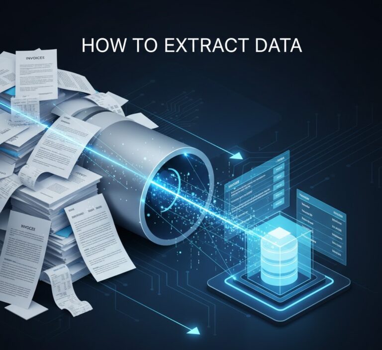
4. The Critical Role of Data Extraction
You cannot generate a report about data you don’t have. This brings us to a critical bottleneck in understanding what is report generation.
Most companies have excellent data in their SQL databases, but massive blind spots regarding external data: supplier invoices, logistics contracts, and competitor price sheets (PDFs).
The “Garbage In, Garbage Out” Rule
If your reporting engine is fed manual data entry (with its 4% error rate), your report is a lie.
- The Fix: Integrating automated extraction tools like ParserData.
- Workflow: ParserData extracts line items from 1,000 PDF invoices -> Sends clean JSON to the Data Warehouse -> The Reporting Tool generates a “Spend Analysis” dashboard.
Without accurate extraction, report generation is merely “formatting chaos.” Read more about ensuring accuracy in data quality in automation.
5. Key Types of Business Reports
To fully answer what is report generation, we must look at the output. Different departments require different lenses on the same data.
A. Financial Reports (The Ledger)
These are strict, standardized documents.
- Examples: Balance Sheets, P&L Statements, Cash Flow Analysis.
- Automation Focus: Ensuring that every line item extracted from types of financial data extraction matches the ERP exactly to satisfy auditors.
B. Operational Reports (The Pulse)
These track the day-to-day health of the business.
- Examples: Inventory Turnover, Server Uptime, Delivery Status.
- Automation Focus: Speed. An operational report on “Low Stock” must be generated instantly to prevent lost sales.
C. Compliance & Regulatory Reports (The Law)
Governments demand data in specific formats.
- Examples: GDPR Data Access Requests, Tax Filings (1099/W-2), ESG (Environmental) Impact Reports.
- Automation Focus: Accuracy and audit trails.
D. Analytical Reports (The Strategy)
These combine data sources to find hidden trends.
- Examples: Customer Lifetime Value (CLV) vs. Acquisition Cost (CAC) by region.
- Goal: To answer complex questions like what is report generation doing for our bottom line?
6. Technologies Behind the Scenes (API, SQL, No-Code)
For the CTOs reading this: how do we build this? Modern report generation relies on a three-tier stack.
Tier 1: The Database Layer (SQL/NoSQL)
Data must live somewhere structured. Whether it is a cloud warehouse like Snowflake or a traditional SQL database, this is the “Source of Truth.”
Tier 2: The Integration Layer (APIs)
This is the nervous system. APIs connect the raw data sources to the database.
- Role of ParserData: It acts as the gateway API for unstructured files. When a PDF arrives via email, the API triggers, extracts data, and pushes it to the database. Learn more about the role of API in automation.
Tier 3: The BI Layer (Visualization)
Tools like Tableau, PowerBI, or Looker sit on top of the database. They run the queries and render the visuals. They don’t “create” data; they display it.
7. Strategic Benefits of Automation
Why invest budget in this? The ROI of understanding what is report generation and automating it is measurable.
1. Democratization of Data
In manual systems, you have to ask an analyst to “run a report.” In automated systems, the report is always there. Sales managers can check their own KPIs without waiting for IT, increasing organizational agility.
2. Elimination of “Shadow IT”
When reporting is hard, employees build their own secret Excel sheets. These “Shadow” reports are often wrong. Centralized automation ensures everyone is looking at the same numbers.
3. Scalability
Manual reporting creates a linear cost: more data = more analysts. Automated reporting has zero marginal cost. You can process 10 invoices or 10,000 invoices with the same setup using scalable tools like ParserData.
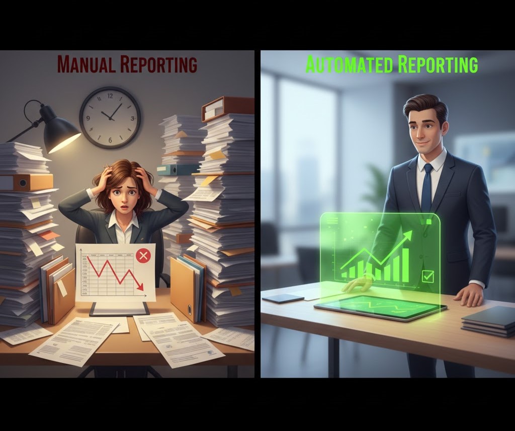
Comparison: Manual vs. Automated Reporting
To fully grasp what is report generation today, compare the traditional manual approach with modern automated pipelines.
| Feature | Traditional (Manual) | Modern (Automated) |
|---|---|---|
| Speed | Slow (Days/Weeks delay) | Instant (Real-time) |
| Data Accuracy | Low (Copy-paste errors) | High (Validated by rules) |
| Scalability | Linear (Need more staff) | Infinite (Cloud scaling) |
| Data Sources | Siloed (One by one) | Integrated (All at once) |
| Cost per Report | High ($50 – $100 in labor) | Negligible (Cents via API) |
Table: The shift from manual entry to automated intelligence.
Pro Tips for Effective Report Generation
Implementing a new system can be daunting. Here are three expert rules to ensure your team understands exactly what is report generation meant to achieve for your specific goals.
💡 Tip 1: The “5-Second Rule”
A good automated report must be understood in 5 seconds or less. If your dashboard requires a manual to interpret, you have failed. Use traffic light colors (Red/Yellow/Green) to highlight KPIs instantly.
💡 Tip 2: Move from “Time-Based” to “Exception-Based”
Stop sending reports every Friday if nothing changed. Configure your automation to trigger reports only when an anomaly occurs (e.g., “Inventory dropped below 10%” or “Spending increased by 20%”). This reduces alert fatigue.
💡 Tip 3: Clean Data First, Visualize Second
Do not build a dashboard on dirty data. Prioritize the ingestion layer. Use tools like ParserData to ensure every PDF invoice is extracted correctly before it hits your visualization tool. Remember: beautiful charts based on wrong data are dangerous.
8. Real-World Case Studies
Case Study 1: The Retail Chain (Inventory Visibility)
A retail chain with 500 stores struggled with “Stockouts.” Store managers manually emailed PDF inventory counts weekly.
- The Fix: They automated the ingestion of these PDFs.
- The Report: A real-time “Global Inventory Dashboard” was generated every hour.
- Result: Reduced stockouts by 30% and increased revenue by $12M.
Case Study 2: The Marketing Agency (Client Reporting)
An agency spent the first 5 days of every month copying data from Facebook, Google Ads, and SEO tools into PowerPoint for clients.
- The Fix: They set up an automated pipeline integrating all APIs.
- The Report: Clients received a live link to a dynamic dashboard.
- Result: Saved 400 labor hours per month and improved client retention.
9. Future Trends: Generative BI
The definition of what is report generation is shifting from “Static” to “Conversational.”
Generative AI & NLP
Instead of configuring filters on a dashboard, users will simply ask: “Show me a report of all vendors who raised prices by more than 5% last quarter.” The AI will generate the SQL query, fetch the data, and render the chart instantly. This is the future of “Self-Service Analytics.”

Conclusion
So, what is report generation in 2026? It is no longer about printing paper. It is about building an automated ecosystem where data flows seamlessly from the messy real world (PDFs, emails) into the clear, actionable world of business intelligence.
It starts with clean data. If your extraction process is broken, your reports are worthless. By leveraging AI extraction tools like ParserData to feed your reporting engines, you build a foundation of truth that drives profitable decisions.
Stop reporting on the past. Start predicting the future. Try ParserData for free and automate your data ingestion today.
Frequently Asked Questions
What is report generation in simple terms?
Report generation is the process of collecting raw data from various sources (like databases or PDF invoices), processing it to apply logic, and presenting it in a readable format like a Dashboard, PDF, or Excel sheet.
How does automated report generation save money?
It reduces the manual labor required to compile data by up to 90%. Instead of paying analysts to copy-paste data from spreadsheets, businesses use automation to generate reports instantly, allowing staff to focus on strategy.
What tools are used for report generation?
Tools range from BI platforms (Tableau, PowerBI) to developer libraries (JasperReports) and data extraction APIs like ParserData that feed clean data into these systems.
Can report generation be done in real-time?
Yes, modern dynamic reporting tools connect directly to live databases via API. This allows for “Real-Time Reporting,” where the dashboard updates the second a new transaction occurs.
What is the difference between static and dynamic reporting?
Static reports (like a PDF emailed monthly) capture a snapshot in time. Dynamic reports (like an interactive web dashboard) allow users to filter, drill down, and view live data changes.
Recommended
- Why Integrate Data Analytics? The 2026 Enterprise Explainer
- 25 Types of Business Documents to Automate
- How to Convert PDFs to Structured Data
- 5 Reasons Why Use API for Data Integration
Disclaimer: All comparisons in this article are based on publicly available information and our own product research as of the date of publication. Features, pricing, and capabilities may change over time.